Review Analyzed Initiatives
After logging in to Initiative Analysis, you will see a home page showing all Completed initiatives by default. This will include initiatives submitted by all Initiative Analysis users at your institution. An initiative appears in the Completed tab after it’s been submitted to Initiative Analysis and the persistence lift has been calculated after PPSM.

Each Completed initiative has a corresponding card, showing basic details about the initiative and the results of impact analysis.

The top of the card indicates the lift in persistence that was measured for this initiative using Initiative Analysis. Persistence is defined as a student re-enrolling for the next term and staying enrolled past your institution’s census date (or add/drop period) or graduating. It’s important to understand how this lift is calculated and which students are included in analysis.
An icon on the initiative card indicates the result of the initiative on persistence outcomes.
- ⬆ A green icon with an upward arrow shows a statistically significant (p-value less than 0.05) increase in the persistence rate of participants.
- ⬇ A red icon with a downward arrow shows a statistically significant (p-value less than 0.05) decrease in the persistence rate of participants.
- ➖ A gray icon with a dash shows that the effect on persistence for participants was not statistically significant. An initiative may not have statistically significant impact results if the number of matched participants and comparison students was low (such as fewer than 1,000 students), if there was a lot of variability in the results of bootstrapped samples, or if the persistence lift was very small. On the other hand, an initiative with a small number of students included in analysis may still show statistically significant results if the persistence lift was very pronounced. Results that are not statistically significant could still be meaningful. At this point, you may consider collecting more data before redoing the analysis or rethinking the initiative design.
Beneath the lift in persistence, find other information about the initiative:
- Confidence interval: The percentage indicated beneath the lift in persistence (such as +/- 1.6%) shows the 95% confidence interval for this initiative’s impact results. This is calculated by multiplying the standard deviation of measured impact across multiple bootstrapped samples by 1.96.
- Initiative Name: The name given to this initiative by the user who added it.
- Number of Analyzed Participants: The number of participant students submitted in the uploaded student list who were matched with a comparison student through PPSM. This number represents the total number of participant-comparison student pairs used for impact analysis.
- Initiative Goal: The goal for this initiative that was entered by the user who added it.
- Analyzed Terms: The start and end terms included in the uploaded file, if these terms are verified and kept during data validation. If you choose to ignore either of these terms during data validation, you will see the earliest and latest terms that were actually submitted.
- Submission Details: The date this initiative was added and the name of the user who added it.
Click the search icon in the upper right corner to find a specific initiative. Type the name of the initiative into the search box to see matches.

Narrow down the initiatives you see on the home page by clicking ‘Filter‘ to the left of the search icon.
You have four filters that you can apply:
- Lift in Persistence: View only the initiatives where a positive lift in persistence was observed or only those where a negative lift was observed, or hide initiatives that did not have statistically significant results.
- Submission Time Period: View only the initiatives submitted this week, this month, or this year.
- Start and End Terms: Select a start and end term to view only the initiatives that took place during the specified range.
- Number of Analyzed Participants: Move the slider to view only the initiatives where the number of analyzed participants was within the specified range.
Select as many filters from each category as you would like. After selecting filters, click the Apply Filters button to refresh the home page. To modify your filter selections, click the ‘x’ to the right of any selection or click ‘Clear All Filters’ to the right of your selections.

If you’re looking for a recently added initiative, impact analysis may not be complete. Check the Pending tab to see initiatives still in progress.
If initiative analysis fails, the initiative card will remain in the Pending tab and you’ll see a red ‘x’ icon in the upper right corner of the card.
To resubmit the initiative with the same data file and previously submitted information, click the card flip icon in the lower right corner. Select the option to “Resubmit Initiative” and initiative analysis will begin again using the same data set and details.
How is persistence lift calculated?
The lift in persistence is determined by comparing outcomes of participants versus non-participants. The students who participated in the initiative were matched through PPSM with matched students who were eligible but did not participate, and the difference in predicted and actual outcomes are compared. The
Important: Initiative Analysis uses the same definition of persistence (such as fall-to-spring, term-to-term) for your institution as does Administrative Analytics.
When students are matched through prediction-based propensity score matching, their persistence predictions should be similar to ensure that they were equally likely to persist independent of initiative participation. Persistence predictions are calculated for each student who is currently enrolled in at least one course. The variables that have historically been predictive of persistence at your institution are used to generate prediction scores for current students, showing their individual likelihood to persist. The persistence lift calculation considers the predicted persistence rates for the matched participant and comparison groups to remove any bias that may have remained after matching, especially in the case of small data sets.
First, the predicted persistence rates for the participant group and the comparison group are determined, informed by your institution’s persistence model. Next, the actual persistence rates for the two groups are measured. The lift in persistence is calculated by first taking the difference between the actual and predicted persistence rates for the two groups:
- C = (actual – predicted persistence rates of comparison group)
- P = (actual – predicted persistence rates of participant group)
The difference of the resulting values is the lift in persistence that you see on the initiative card:
- Lift in persistence = P – C
For large data sets, this calculation is often very similar to the result of measuring the difference in the actual persistence rates of the participant and comparison groups. The difference in predicted persistence rates between the two groups should be negligible if the sample size is very large.
See initiative details and outcomes
Click any initiative card from the home page to see initiative details. The initiative details page contains information about the initiative, including descriptive context submitted by the user when the initiative was added and results from the impact analysis.
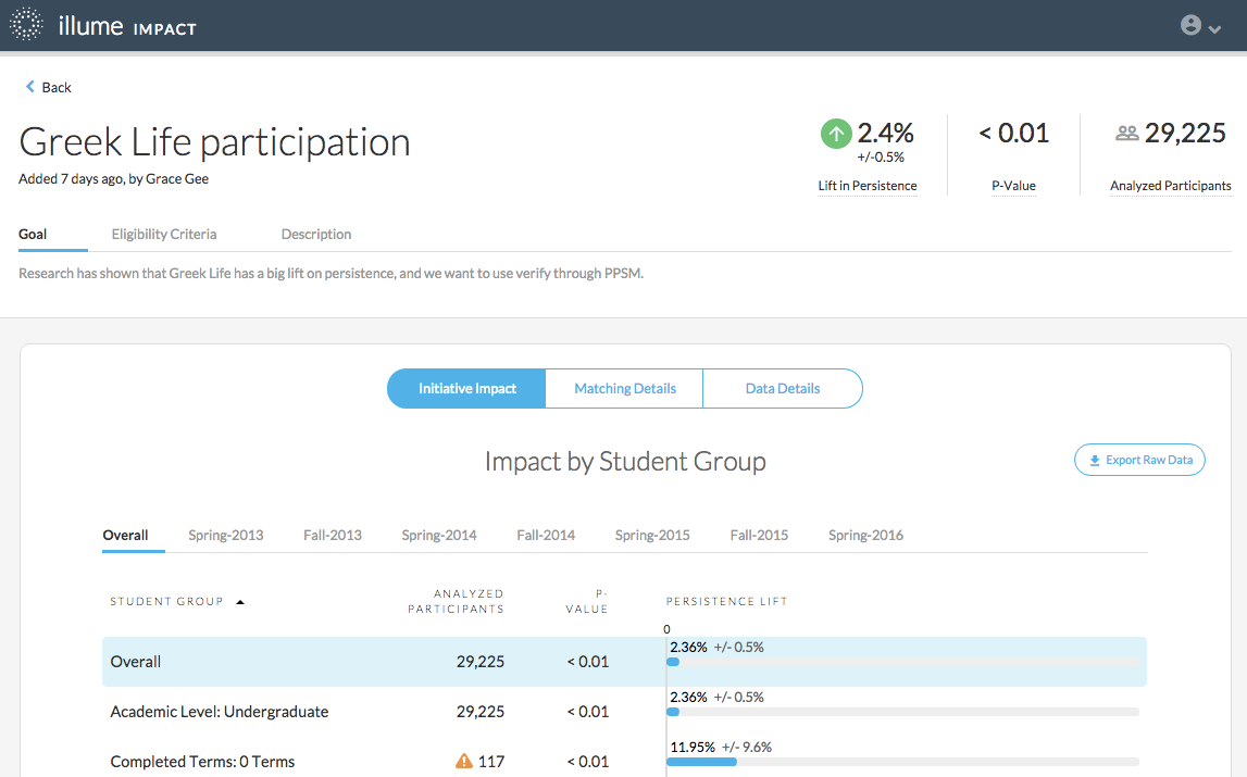
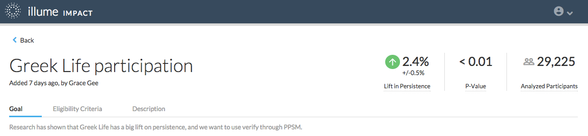
Review the top of the page to see basic information about the initiative’s goals and outcomes:
- The initiative name, goal, eligibility criteria, and description are available for context as you interpret the results. These entries were provided by the user who added the initiative. If you submitted this initiative, modify the details by clicking the existing text within any of these fields. Type any updated information and hit Enter to save.
- Persistence Lift is right of the descriptive details. This number is determined by comparing the persistence rate for the students who participated in the initiative who were matched through PPSM with the persistence rate for the matched students who were eligible but did not participate in the initiative.
- P-value indicates the probability of observing similar or more extreme results if the initiative had no effect on persistence. Initiative Analysis uses a statistical significance threshold of p-value less than 0.05.
- Analyzed participants indicate the number of participants who were matched to similar comparison students through PPSM and included in analysis.
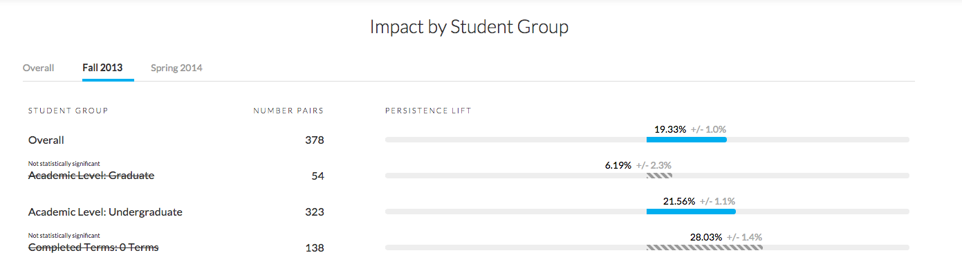
View initiative impact by student group
Find a more granular breakdown of impact analysis results beneath the basic initiative details and outcomes. By default, the tab labeled Initiative Initiative Analysis should be selected. Start by reviewing the initiative’s impact by student group.
When reviewing these drill-down insights, it’s important to understand that the matching process does not ensure that students are matched within these groups. This means that the number of analyzed participants indicated to the right of each student group shows how many students were successfully matched for analysis with any other comparison student (not necessarily another student within that group). Performing matching at the student group level would result in a lower match rate and longer analysis run time.
The possible student groups include:
- Academic Level: A student’s academic classification as undergraduate or graduate.
- Completed Terms: A student’s number of completed terms at your institution.
- Course Modality: Indicates a student’s course modality if the student is enrolled in all online courses.
- Ethnicity: Indicates whether or not a student is of Hispanic or Latino descent.
- Full-time vs. Part-time: A student’s enrollment status as full-time or part-time.
- Gender: A student’s self-identified gender.
- Prediction Percentile: Indicates which quartile of the student population a student’s persistence prediction falls in. If 30% of the student population has Very Low persistence predictions, the lowest 25% will fall into the bottom quartile.
- Race: A student’s race.
- STEM Major: Indicates whether a student’s desired degree is designated as a STEM program as defined by the federal government.
- Student Type: Indicates whether a student is enrolling as a first-time-in-college student, as part of a dual-credit program, as a transfer or transient student, or as a readmitted student.
The actual student groups you see will vary depending on the data provided by your institution.

These student groups may look familiar, as they match filter options in Administrative Analytics. For each listed student group, see the number of analyzed students who met the group criteria during the analyzed terms. For example, an undergraduate student successfully matched and included in analysis who was enrolled full-time as a STEM major would be included in the Undergraduate, Full-time, and STEM student groups.
Find the number of analyzed students and p-value to the right of each student group.
If the p-value for any group exceeds 0.05, the group name will be crossed out. This indicates that the analysis results for this student group are not statistically significant. While it is advisable to apply more stringent p-values for group comparisons, we use the p-value threshold of 0.05 to surface these insights into segment-level impact results.

The persistence lift for each student group is also shown. This is the lift in persistence observed between the analyzed participants and comparison students who meet the student group criteria (such as the persistence difference between part-time students who participated and part-time students who did not participate). This is calculated the same way as the overall lift in persistence calculation. Refer to How is persistence lift calculated? for details about this calculation.
By default, you will see the overall impact for each student group over all analyzed terms. Switch to any individual term to view the impact for each student group during that term only.
Export Raw Data
You may want to share the impact analysis details with other stakeholders at your institution. Easily export overall impact details, Initiative Analysis by Term, and Initiative Analysis by Student Group from the initiative details page. When the Initiative Initiative Analysis tab is selected, click the Export Raw Data button to download a .csv file containing the persistence outcomes and raw values used to calculate persistence lift.

The file will include overall persistence lift details at the top, followed by a breakdown of details for each term the initiative was offered. A breakdown for each student group is shown for the overall initiative results and for each individual term.
Recall the values used to calculate the lift in persistence:
- Predicted persistence rate for initiative participants included in analysis
- Actual persistence rate for initiative participants included in analysis
- Predicted persistence rate for initiative comparison group included in analysis
- Actual persistence rate for initiative comparison group included in analysis
These values are all included in the .csv file for each listed group, as well as the resulting value for persistence lift.
Validate student matching
After reviewing Initiative Analysis details, click the Matching Details tab to confirm that students were successfully matched for analysis.
Recall that participant students are matched with comparison students on two metrics:
- Persistence prediction: The likelihood of the student to persist to the next term and stay enrolled past the add/drop date.
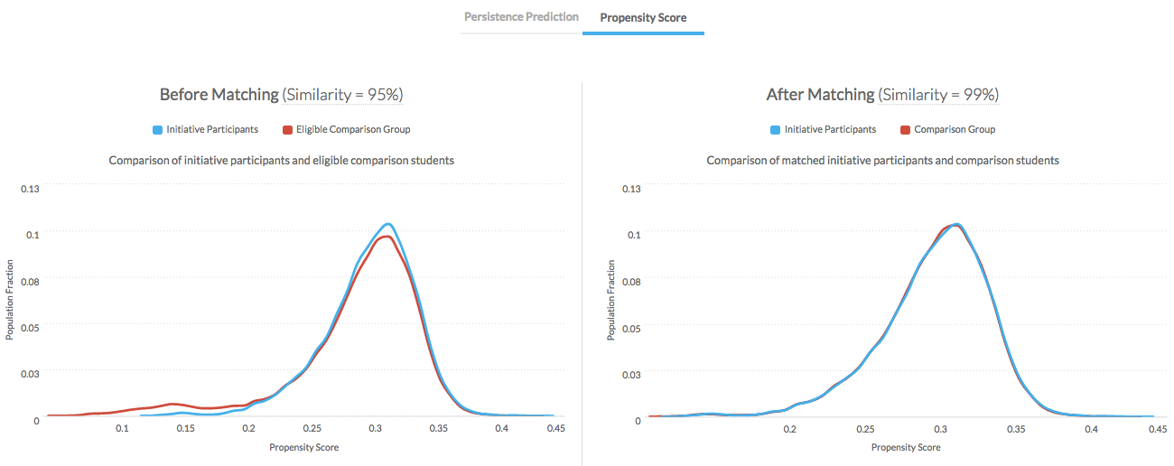
- Propensity score: The similarity of the comparison student to students who participated in the initiative.
The charts on the Matching Details tab show the distributions of these scores for participants and the comparison group before and after matching. You should see the matching details for Persistence Prediction by default.
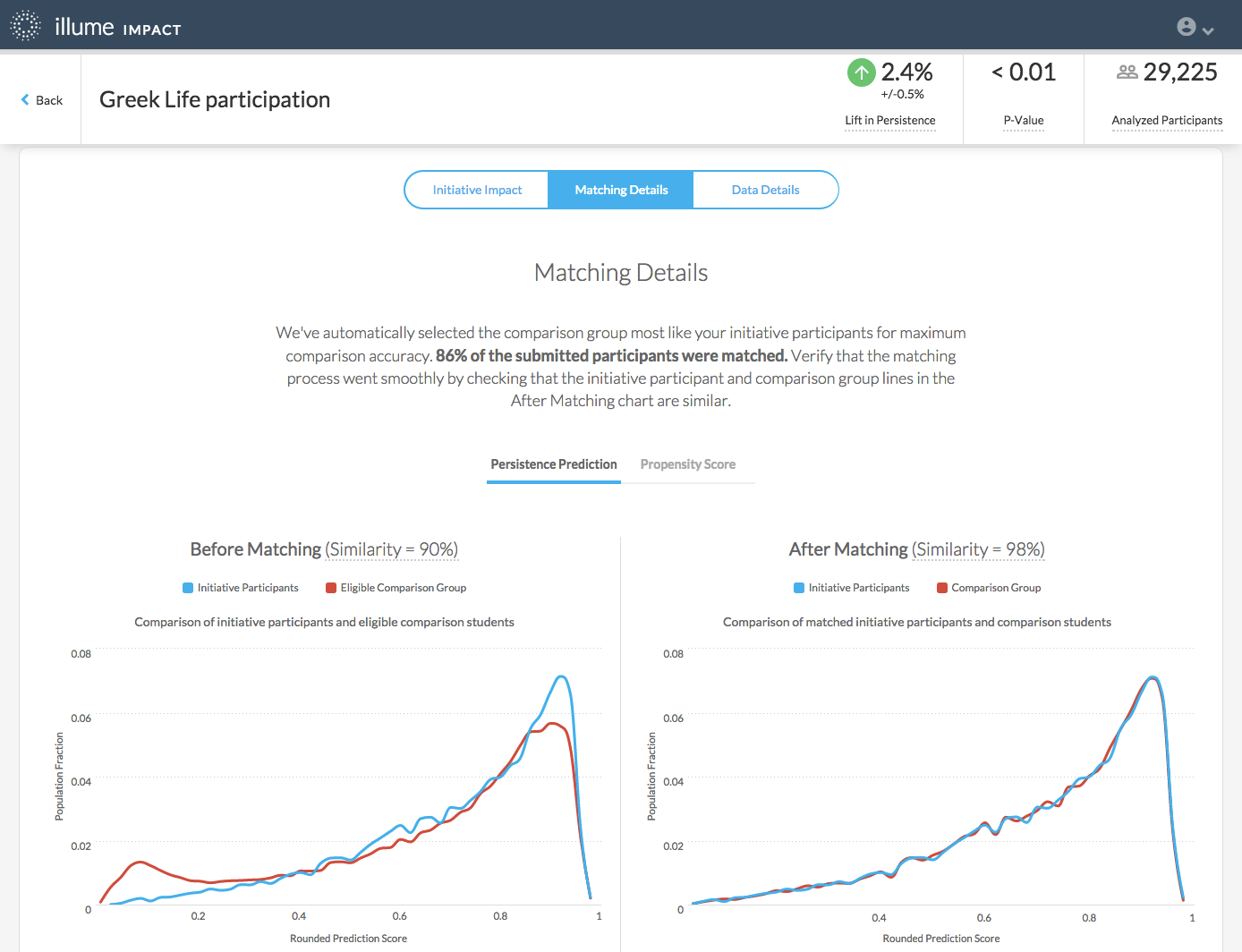
The Before Matching chart shows the scores for all submitted participants and the eligible comparison group. Before matching, the distribution of scores may be very different. You may see some selection bias, such as a participant group with much higher persistence predictions for an opt-in initiative such as tutoring. It follows that students who chose to attend voluntary tutoring would be more likely to persist at your institution. The matching process takes care of this bias before evaluating the impact of the initiative.

The Similarity indicated on the chart shows how close the scores of the participants and the comparison group are. The closer this measure is to 100%, the more similar the scores of the student groups used for analysis. Before matching, this measure will include natural separation between the scores. After matching, the score distributions should be much more similar.
The After Matching chart shows the scores for the selected participants and the matched students from the comparison group.
Click the Propensity Score tab to switch to the distributions for those scores.
Review student data
Click the Data Details tab to see how many students from each term were submitted for matching and impact analysis.

For each term included in analysis, see:
- Initiative participants displays the count of participants submitted for PPSM for the indicated term. This is the number of participants who could be identified in the data set from the uploaded student list and who were verified during data validation.
- Eligible comparison students shows the count of eligible comparison students who were identified in the data set from the uploaded student list or remaining student population and who were verified or added during data validation.
- Eligible comparison terms lists the terms from which comparison students used for matching with initiative participants were identified.