Paired Predictor Plots
Paired Predictor plots let you combine powerful predictors to surface new insights and find precisely targeted groups of students in need of outreach.
Accessing Paired Predictors
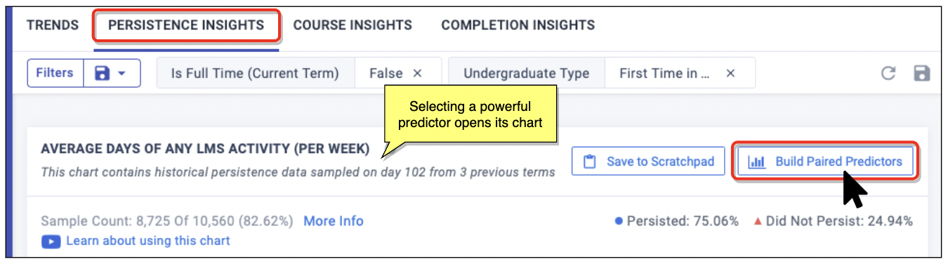
On the Persistence Insights tab, the bottom of the page shows the current Powerful Predictors, grouped and ranked by their predictive strength. Drilling down on a predictor lets you access the option to build a predictor pairing, to research how predictors relate, historically.
- Select the panel for the category you want, such as Engagement (LMS).
- Select one of its predictors, such as Average Days of any LMS Activity.
The predictor’s detail page opens, with the historical data charted at top. - From the far right of the chart, select the Build Paired Predictors button:
To make use of a predictor pairs, you will work with its data visualizations and student segmenting:
- Select your two Powerful Predictors.
- Investigate the Paired Predictor’s chart of ratios and heat map plot for insights (see details below).
- If the insight is useful, select Save to Scratchpad, where it can be shared.
- If action is appropriate, open a Student List and start an outreach effort.
What Quadrants Mean
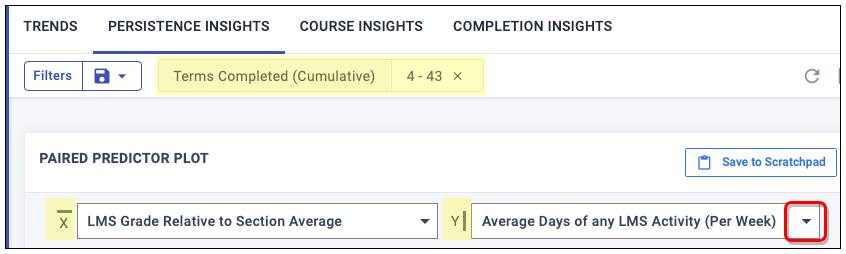
From any Powerful Predictor Chart, select the Build Paired Predictors button at top right to see the effects of two Powerful Predictors in combination, historically.
- X-axis: This is your original Powerful Predictor.
- Y-axis: Use the drop-down menus to select your second Powerful Predictor.
As soon as you select a new predictor, the page refreshes with new visualization charts, which give you different views into the effect of each variable on persistence rates for the students currently filtered.
Quadrants in both charts are created where the data splits in half, divided by the median (mid-point) values for each predictor, which means that half the students fell above and below this point.
What each quadrant means depends on its position:
| Students with x-values below the median y-values above the median | Students with values above the median for both variables |
| Students with values below the median for both variables | Students with x-values above the median y-values below the median |
Important: “Above” might not mean “better”. For example, the predictor Sections Failed is one for which a higher score is a bad thing. Therefore, focus on the red data to keep tuned to the problem areas.
Reading the Heat Map
The right chart is a distribution showing a granular breakdown of student behaviors. The heat map shows how persisting and non-persisting students were distributed over the continuum of values for each Powerful Predictor. Hover over any point in the distribution to see the historical ratio of persisters to non-persisters at that combination of values.
- Black lines show the median (mid-point) values for each Powerful Predictor among the student group.
- Red indicates worse: a higher percentage of non-persistence than persistence among these students.
- Blue indicates better: a higher percentage of persistence than non-persistence.
- Gray indicates blank, where there is no historical data for that combination of predictors.
- Lighter shades of blue and red correspond to fewer students at that combination of values.

Reading the Ratios Chart
The left chart shows the historical ratios of persisting to non-persisting students, the persistence rate for that group, and the number of students in each quadrant who persisted and did not persist (based on known historical outcomes).
- Review the center circle, which has persistence information for the full student group, as filtered.
- Look to color for meaning:
- Red signals where the ratio of persisters to non-persisters is worse than average.
- Blue signals a better-than-average persistence ratio.
The calculated ratios are offered in multiple forms, for easier comparison:
| Persistence Rate | 84.83% | Persisting students ÷ Total students |
| Simplified | 5.59 : 1 | How many students persisted for every 1 who did not |
| Actual | 1,364 : 244 | Persisting students : Non-persisting students |
Important: This is persistence history, so it will not match the persistence predictions on the dashboard.

To see the student list for a particular combination of the two behaviors, select Currently Enrolled Students within a quadrant of the ratio chart.
Example Analysis
Say that you wanted to check a belief of your colleague, that a student’s grades relative to their section are more telling for their persistence than is their LMS usage. Your analysis might go like this:
- To focus on mid-career and higher students, you filter on Terms Completed, removing those with fewer than 4 terms.
- You open the top Powerful Predictor for your institution, LMS Grade Relative to Section Average.
- You select the Build Paired Predictors button.
- From the drop-down list for Y, you choose Average Days of any LMS Activity (Per Week).
As you expect, there is a large drop-off in persistence for those in the lower-left quadrants (red X), who have both worse-than-average grades relative to their section peers and worse-than-average LMS usage:

From the chart, you can note several things of interest for your colleague:
- The ratio table reveals that persistence is correlated a bit more strongly with higher LMS usage (1) than with higher section grades (2).
- The heat map reveals that outcomes drop for those students with better grades when they fall to using the LMS less than once a week (signifying low engagement).
- The heat map likewise reveals that students with poor grades get a persistence boost when they use the LMS upwards of 3 times a week (signifying engaged effort).
Opening a Student List
To see a list of which enrolled students exhibit some combination of the two behaviors, select the Currently Enrolled Students link in any quadrant of the ratio chart:

This list will include students in all persistence prediction buckets.