Persistence and Powerful Predictors
Persistence is successful retention: the outcome of a student re-enrolling for a future term and staying enrolled. Persistence predictions and powerful predictors are key to finding ways to take action to boost retention.
What is ‘Persistence’?
Understanding what ‘persistence’ means here is central to interpreting the data presented to you in Administrative Analytics. Persistence has two parts; to persist, a student must achieve two things:
- Have enrolled for a future term at your institution
- Have stayed enrolled in that term past the census date (usually 14 days after the start of term)
Defining Continuity — Persistence is calculated based on how your institution defines program continuity. Institutions with high persistence may choose a longer continuity (such as Fall) to surface additional students. Here are the options that institutions choose from:
| Traditional (most institutions) | Fall → Winter/Spring Winter → Spring Spring → Summer/Fall Summer → Fall |
| Quarterly | Fall → Winter Winter → Spring Spring → Summer Spring/Summer → Fall |
| Term-to-Term | This Term → Next Term |
| Season-to-Season | This Season → Same Season Next Year |
| All-to-Fall | Fall, Winter, Spring, Summer → Fall |
| Custom | Institution’s unique persistence definition |
Persistence Prediction chart
The Persistence Prediction chart shows the expected persistence of two entire groups. It offers a quick comparison of your active filters either with all active students or with a filtered set: 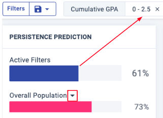
Each bar combines the persistence predictions of all students that qualify:
- Active Filters: The percentage of enrolled students meeting the selected filter criteria (top of page) who are predicted to persist.
- Overall Population: The percentage of all active students who are predicted to persist.
Tip: Use the drop-down list to compare your active filters to one of your saved filter sets.
Prediction Distribution chart
The predictive models for your institution deliver an individual persistence prediction for each of your students (which you can see as a column in Student Lists). View the distribution of these individual scores in the Prediction Distribution pie chart, to the right of the overall persistence predictions.
The Prediction Distribution includes only those students who meet the active filter criteria. When no filters have been applied, the Prediction Distribution represents the full set of active (currently enrolled) students.
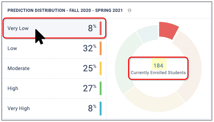
Review the left column to see how many of your active students fall into each persistence prediction bucket: Very Low, Low, Moderate, High, and Very High. Select the help pop-up to see if the buckets for your institution are set up differently from the default ranges, shown here:
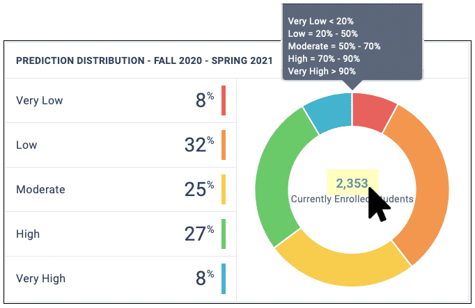
All students — Look to the center of the pie chart to see the total number of students as currently filtered. Click this number to open the Student List for all of those students.
Students by bucket — Hover over any prediction bucket to update the pie chart with the number of students in that bucket. To open the Student List for that bucket, click on the bucket name.
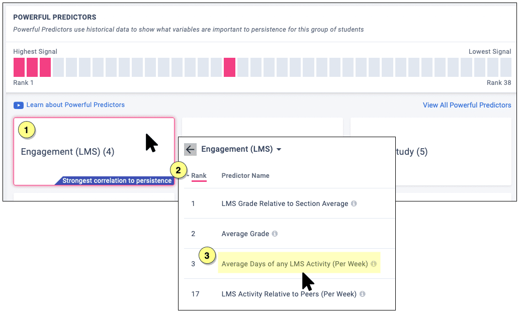
Powerful Predictors
Each Powerful Predictor is a predictive factor or behavior for the filtered student group. These variables are specific to your institution, based on which indicators are proven most helpful in predicting persistence for your unique student population.
Powerful Predictors appear in order of predictive power, and you can select them to reveal the specific predictors (data columns) that make up the Powerful Predictor. In this example, “Engagement (LMS)” is made up of 4 related predictors, with Average Days of any LMS Activity being the third most predictive among them:
Tips:
- Click the “i” icon to the right of any individual Powerful Predictor to pop up a definition for that predictor.
- Expect the list of Powerful Predictors to keep changing as you add and remove filters. Real-time updates ensure that you are always seeing the most predictive variables for the students you are filtering.
- To avoid losing your view of a certain combination of filters, save to the Scratchpad before changing your filters. (You can mark them Private to hide them from others using the Scratchpad.)
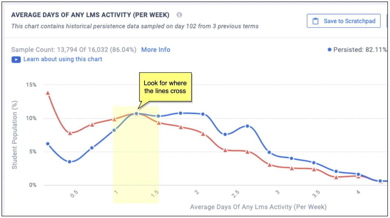
Charts for Predictors
When you select a Predictor from the list, the historical persistence data is charted at the top of the page (directly under the filters), so that you can explore and take action on any insights.
- Blue lines chart the students who persisted
- Red lines chart the students who did not persist
To find a key insight, look for tipping points, where the lines cross (where persistence and non-persistence flip).
For example, this predictor is showing that successful students are those who log into the LMS more that once a week:
With the chart open, you can select Save to Scratchpad (for a shareable or private snapshot) and go on to Build Paired Predictors, which lets you see the effects of this predictor when combined with another.